Blog.
There Is Something Weird Going On With the Clock on 24
MAY 15, 2006
Okay, I am a TOTAL FREAK for having noticed this weird typographic pattern on 24. You have been warned. My discovery of this bizarre typographic anomaly took place in a few steps over the course of several episodes, so bear with me as I explain.
I loved the first season of 24, but I gave up on the show after the second season, because the pulled-out-of-thin-air plot twists, the hammy acting, and the fluid-as-water loyalties of the characters became increasingly maddening. “This show is ridiculous,” I eventually said to myself, perhaps when drunk, because I don’t usually talk to myself. “I refuse to watch it anymore.” But thanks to recommendations from a few enthusiastic friends, I returned to the show late in the fourth season, and now I’m totally hooked again. The fifth season has been fantastically entertaining. The producers have worked out most of the kinks in the format and now know exactly what they’re doing. The show is still ridiculous sometimes, but that’s part of the fun.
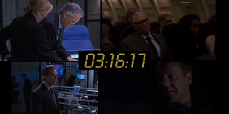
A few months ago I began to notice something unusual about the 24 clock—the timer that appears onscreen at regular intervals throughout each episode. It’s modeled on a standard LED clock, the kind you’ll see on the radio next to your bed or the microwave in your kitchen or inside a ticking rogue nuclear weapon once you’ve pulled off the face plate. You know—the standard workaday places. On a typical such clock, each number is rendered within a matrix of two vertical bars on either side and three horizontal bars in the middle. At first glance, the 24 clock appears to be based around exactly that sort of matrix. Here’s a screenshot from last Monday’s episode:

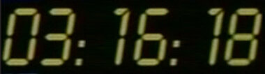
A couple of months ago, I noticed that the 24 clock renders the numeral 1 with a short serif at the top. Here’s another screenshot from last Monday’s episode, with the serif circled:

That serif is a needless typographic flourish. A normal clock wouldn’t have a serif there, and in fact it’s totally illogical for the 24 clock to have one: None of the other numerals show evidence that the LEDs on top are split in half and can render a serif. The LED bars along the top are always solid when used in the other numerals, and the light that illuminates the top bars in the other numerals is consistent and unbroken.
So I noticed this and it amused me, but I didn’t think much of it, because why should the 24 clock have to be logical and believable? Every episode of the show contains a lot of stuff that’s illogical and unbelievable. This typographic inconsistency is no more ridiculous than, say, Jack Bauer sneaking onto a diplomatic flight, hijacking the plane in midair, finding the evidence that implicates the president, forcing the bad-guy copilot to land the plane on a Los Angeles freeway, and then eluding the president’s military goons once the plane comes to a halt on the makeshift runway. To mention just one recent half-hour sequence.
Okay, still with me? Then I noticed that these half-width 1’s are always kerned artificially close to the numeral (or the colon) to its left:

Here’s what that last image would look like if the 1’s weren’t kerned:
A real LED or LCD clock has a static matrix; every numeral takes up exactly the same amount of space as every other numeral (except sometimes the leading 1 at the beginning), and the numerals are not kernable. In other words, real-life LED clocks use a monospace or fixed-width font, but the 24 clock uses a variable-width font. By choosing to artificially kern those 1’s, the show’s visual designers opted for typographic elegance over a more literal rendition of a clock.
Okay, still with me? Then I found myself wondering what would happen if the clock had to display a 0 turning into a 1 or a 1 turning into a 2. If the 1’s are always artificially kerned, then there isn’t room for a 1 to turn into a 2 (unless the width of the entire clock were to shift at that moment, which would look terrible and jarring), and a 0 can’t turn into a 1 without leaving a gap to the left of the 1.
And that’s how I stumbled onto this weird pattern: The clock never shows a 0 turning into a 1, and it never shows a 1 turning into a 2. (There are some very rare exceptions, which I explain below.) Check it out the next time you watch the show, if you watch it. The clock will display a sequence like “04:42:24, 04:42:25, 04:42:26, 04:42:27, 04:42:28,” then stop, or “04:21:16, 04:21:17, 04:21:18, 04:21:19,” then stop. I’ve only been watching for this pattern for six or eight episodes, so I don’t know if it’s been like this since the first episode of the first season—but I’m betting that’s the case. The onscreen time sequences are dictated partly by the typographic limitations of the clock font.
Here’s a video that contains all but one or two of the interstitial clock sequences from last week’s episode:
The only time I’ve noticed an exception to this rule was at the close of a couple of recent episodes, when the clock showed its standard end-of-episode turnover into the following hour. In the case of the sequence “01:59:57, 01:59:58, 01:59:59, 02:00:00,” extra room was provided to the left of the 1 so it could turn into a 2. The show’s designers can’t avoid the typographic problem in that situation, because it’s standard for the show to end with the clock turning over into the next hour.
Like I said, I’m a freeeeeeak.
Don’t forget to configure your TiVo or VCR to compensate for the speech by Mr. 29 Percent tomorrow night. According to Fox, 24 will start about 20 minutes late in the Eastern and Central time zones.
Lucky for us, Kiefer has fully recovered from the incident with the Christmas tree.